
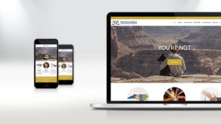
Responsive Mobile Site
What exactly are responsive website designs?
According to marketingland.com. “If you compare a tablet or mobile phone display screen with a PC or laptop equivalent, the main difference between the two is the overall display size on offer.You can shrink that size down into something that a smaller display device can deal with, but when you think about the text and imagery on offer, the smaller screen cannot really compete with its heftier sized brother.

In order to make your website look just as attractive on the comparatively diminutive screen, there needs to be a significant amount of tweaking behind the scenes.
This is where responsive web design in Raleigh, comes into play. Responsive designs break down and modify the fundamentals of an original website page automatically, so that the smaller device can have a more active result.
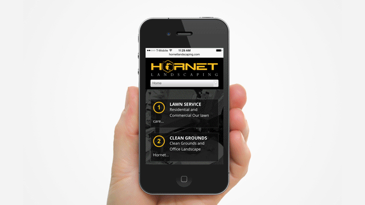
Responsive website designs are not to be confused with mobile website designs. Though they’re completely separate things, we haven’t talked much about mobile designs at all. What is a mobile design?
Mobile websites are built specifically to work on a mobile device; smartphone, tablet, etc. Sounds great, right? Well, mobile website design isn’t always the answer. A mobile website only works on a platform that is mobile. It will not work on a desktop or laptop. In other words, mobile websites are only good for mobile devices. And, you essentially end up with two completely separate websites. Each website requires its own maintenance and separate startup costs. Sort of confusing, right?
So which is best for my business? Responsive or Mobile?
According to marketingland.com, “The technical expertise required in order to create a mobile website is fairly low and this is partially due to the myriad of mobile website templates that are currently available. Getting your products or services out to the huge mobile market is an activity that any business user needs to address, and creating a mobile website will certainly plug that gap in the short term rather nicely.”
BUT if you’re looking for something long term, something that really caters to your current and potential customers, responsive website design is the only answer. Responsive caters to your customers in a more stable and lucrative way. In addition, there is only one website to maintain and pay for.
Web Design Raleigh: The Choice is Yours!
So, while the choice is yours, our web design team in Raleigh recommends setting up an appointment to talk with us about upgrading your website to better serve the needs of your current and potential customers. You owe it to yourself and your business. Contact us, anytime, to talk further about responsive or mobile website design.