
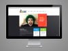
Website Design Trends for 2014
With half of 2013 gone it seems like 2014 is just right around the corner. It’s time to start thinking about the future of your website! 2014 web design trends are already beginning to make a statement and will be impacting websites soon. If you’re interested in getting your Raleigh website caught up with the times, be sure to contact us today!
2014 Website Design Trends:
Flat Design: Probably the most anticipated trend of 2014, flat design is all about embracing the 2D screen! No more drop-shadows! No more heavy textures that make websites look more like 3D! For an in depth look at flat design, be sure to visit us again soon. We will go over this trend in detail in a future post.
Mix-and-Match Typography: Though this is a tricky thing to successfully accomplish, mixing and matching several different types of fonts is a creative way to make typography an exciting part of your overall web presence! It can even help convey messages and tell your business’s story.
Single Page: Instead of putting content on different pages many websites are opting to put all their content on one page that users are able to scroll through without leaving to go to another location. This trend is often, but not always, used in combination with parallax scrolling.
Full-width Background Images: Though photographers often use full-width background images, this trend is not just for them. Photo backgrounds look great with text displayed over them, giving the whole web design a unique look without much work! Carolina Reprographic’s expert photographer can help our Raleigh web designers achieve this look. If you would like more information about full-width background images for your website, contact us!
Responsive Design: Yes, we’ve discussed responsive design and how important it is for all websites several times. Sadly, not everyone has jumped on the responsive design train yet. While not having it isn’t exactly detrimental to your web presence, responsive design is easier for your website visitors to navigate. They’re able to access your website, no matter what device they’re using, without any issues. No annoying zooming for smartphone users, no overlapped content on tablets; the format is the same no matter what device you access the website from!
And of course, if you’re still not sure about allowing TigerHive Creative Group to redesign a new, responsive website for you, we can always help you with designing a separate mobile website for those visitors that only use smartphones to access your website!
Website design trends for 2014 are already storming the internet. If you’re ready to get a head start on some of the trends above, be sure to contact our expert web design team. We can set up a consultation and talk about what you’d like to see happen with your new website. Together, we can create a website that’s innovative, unique, and spectacular!